Video: 03 Effective Data Processing
Hello, and welcome to this session of LC-MS/MS 101. Effective data processing, where you can learn tips and tricks to get the most out of your data. Quickly. I’m Crystal Holt with ScieX, and I’m your moderator today. Today we’re joined with speaker Dr. Karl Oetjen. Dr. Karl ocean is a senior scientist at science, driving food, environmental forensics, clinical and cannabis applications. Before joining Sciex, he completed his PhD at the Colorado School of Mines, where his research focused on non targeted characterization of complex surfactant mixtures, including aqueous film forming foams, which led to the discovery of several per and polyfluorinated alkyl substances that since have been found in a variety of environmental samples, and industrial chemicals. Since joining sax, Karl has worked with numerous labs, creating and implementing both quantitative and qualitative methodologies. And now I’ll turn it over to Karl.
Thanks, Crystal. So today we’re gonna be talking about some data processing. So if we think about data processing, or we think about LCMS analysis, aside from sample prep, we’re probably going to be spending the majority of our time doing data processing, right. Once we have our method set up, like we discussed in the last section, it’s pretty much good to go. And now it’s time for us to get on the computer, start analyzing our unknown samples, and start building our curves. So just a really quick, brief, high level reminder of what we’re going to be talking about today. When we think about quantification, what we’re doing is we’re really, our main goal is to go ahead and quantify unknown samples. So to do that, we’re building a calibration curve, right? So we’re taking known samples with known concentrations, and we’re plotting them, we’re plotting the area specific to the concentration. And what that allows us to do is that when we find ourselves in scenarios where we have an unknown sample, so say, Here’s my unknown sample, I can go ahead and get a value. So I can say, hey, in my unknown sample, there’s actually 2000 puka grams per mil, of this particular analyte. So that’s really our goal. For from building our method to getting here, this is this is the end goal, this is our goalpost of what we really want to accomplish today. But how do we do that efficiently? So during the last poll, we sent out just some of the areas of interest. And it seemed like everybody was pretty interested in mostly everything. So we’re going to kind of touch on some of the highlights there, and some tips and tricks to process some data efficiently and effectively.
Slide #
So before we build our calibration curve, the first step is to integrate our peaks.
 So how do we do that? Well, there are a few different scenarios that you might find yourself in, I certainly have found myself here before, where your integration algorithm, whichever one you may be using, went ahead and integrated a matrix interference along with your peak. So how do we sort of address this issue? The first option would be to go ahead, and I like to call it making a foot. But really, what we’re doing is splitting the valey between those two peaks. So between our interference and our analyte of interest, and sort of predicting where that baseline would be. So we’re recruiting that foot or that sort of right angle, integration. So that’s one approach that we could do.
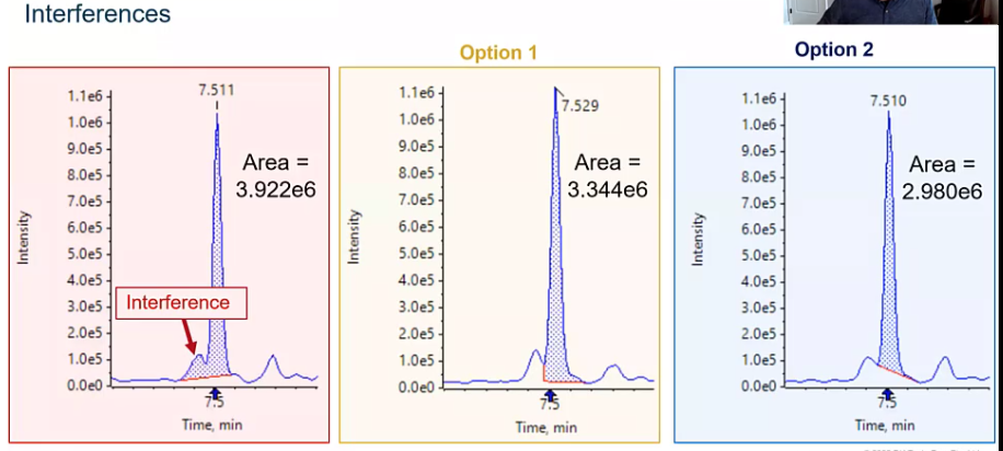 The next would be to go ahead and draw a tight baseline. So again, removing that matrix interference, integrating just straight across our peak. Both options are good options, it’s going to depend a little bit on who you’re reporting to what they think is acceptable. But the thing I want to kind of get across is that we need to be consistent. Regardless of whether you choose option one or two, we need to make sure that we’re consistent in the way we integrate our peaks. And you can kind of take a look and look at that area, it changes quite a bit from for each of the six when we’re including that interference. Two of which is chopped option two, it’s only three to the six. That’s a pretty big difference in area. So if we’re integrating inconsistently, we might have, you know, a calibration curve, that’s not the greatest, or worst case scenario. We might have some unknown samples that are being quantified in a way that’s not super accurate, and we really want to avoid that. All right, so we want to be consistent.
Slide: Tailing #
[5:06] Another scenario, when it comes to integration that I see quite often is when you have a tailing peak and a noisy baseline. So let’s say you’ve got this peak that’s tailing. In the last section, we really talked about chromatography, some of the things we can do to avoid this, but it’s the real world and sometimes peak tail, and there isn’t too much we can do about it. Maybe this compounds super polar, or maybe your sample composition has to be made in such a way that this is just the reality you have to live with. But what we don’t want to do is integrate our baseline too high, right, we don’t want to not include that tail. And you’ll see some times some integration algorithms will go ahead and try to cut that peak a little bit. So if you have that noisy baseline, it thinks, hey, this is where my peak ends. But there’s going to be a big difference between including the tail and not including the tail, right? So we want to make sure we’re consistently integrating under your entire peak, even if our chromatography is less than ideal.
Slide: Smoothing #
So what other situations can we get into and what other variables can we control when we’re talking about integration, and probably the big one that we’re kind of all thinking of is smoothing. So if we kind of refresh ourselves to the first few sessions and talk about points across the peak, so each one of these points represents a time when data was measured. So every one of these points is when the mass spec gave us some piece of information between these points are essentially the straight lines, just drawn to connect the points. And if you look at the top of this peak, which is unsmoothed, you’ll notice there’s a little bit of sort of a sharp edge. And that’s just because that’s where those points fall. And that’s what we end up with when we just draw straight lines between points, right. But what we want to do with smoothing is go ahead and sort of remove some of these inconsistencies and some of the variability that we might experience just based on where our points fall across our peak. And those points really are just related to the cycle time. So how many MRM experiments we have, and how long we’re allowing those experiments to continue. So the dwell time. So it might change from run to run. So we want to make sure that that variability is minimized.
Slide: Over-smoothing #
[7:24] And an easy approach to sort of combat this would be smoothing.
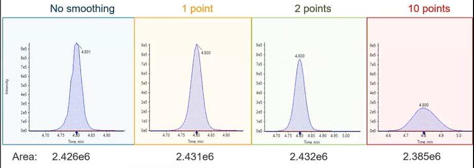 So in the blue, we have a peak that is not smooth, so you can kind of see a little rough around the edges, versus in the yellow where we have a one point smoothing. So the degree of smoothing is going to vary a little bit depending on which integration algorithm you’re using. I’m going to be pretty specific to Sciex software. But the theory is the same whether you’re using a GCMs or LCUV, or a different LC ms ms system, we want to smooth these peaks. So at one point smoothing would be considered a very low smoothing, or a very small amount of smoothing. And what you see is that peak download looks pretty Gaussian. So we’ve removed some of those rough edges, we haven’t really affected its intensity. And if we take a look at the area of the peak, we haven’t really manipulated the area too much either. Versus if we do something like a medium smooth or a two point smooth. Now we start to see that intensities decrease, although the area’s pretty consistent with the other two peaks. And then finally, if we went crazy and wanted to do something super wild, and integrate with or smooth with 10 points, so way, way, way, way over smooth, we noticed that we get this sort of short and fat peak. So instead of the nice six second peaks that we were observing before, now we have a peak that’s almost 30 seconds. And if we look at that intensity, we’ve lost two thirds or more of our intensity.
So why do we all want to avoid this? One, we’re sort of manipulating the data in a way that isn’t representative of what the true data was. And two and probably equally, if not more important, when we spread out that peak, we’re including more that baseline. so any noise, inconsistencies that are included in their baseline are going to be amplified and taken into account in our peak. And if we have a noisy baseline, it’s going to get harder to discern sort of our peak of interest from the baseline itself. So typically, somewhere in the low smoothing or the 1.2 points smoothing is where we want to live.
Slide: Isomers #
How about isomers I get asked a lot about isomers. So here we have a floral chemical, and there are branched and linear isomers.
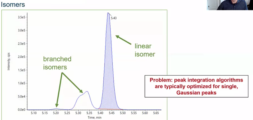 So how do we address this? And the answer is going to depend a little bit based on your goals. Maybe you want to go ahead and quantify the linear isomers separately, which would be fine. But more commonly, folks want to sort of integrate this as a whole and report it as a single concentration since it’s the same Compound just isomers of that compound. So we’ll see this a lot in floral chemicals, but also things like pesticides, etc. So how do we do that? And how do we address this?
Slide: Integrate Isomers #
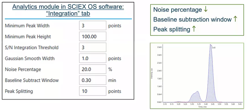
So we talked about smoothing. But there are a few other variables that you kind of have control over to fine tune your integration, specifically, your automated integration, the first would be noise percentage.
 So
So the noise percentage is really how much of that baseline you’re considering. So as you go ahead and drop that number, so you make your noise percentage lower, you’re starting to include more and more of that baseline noise, versus if you make it higher, where you’re just sort of drawing a nice, tight peak. So if you had a single analyte, you would probably make this noise percentage somewhere in the 80-90%. Versus here where we’re trying to integrate some isomers, we’re going to lower that down. Baseline subtraction window, that’s pretty self explanatory. That’s how much of the baseline you’re considering. So how much of a window you want to look out. So 30 seconds, for example. And then probably the the most important variable in this scenario, which would be peak splitting. So if we think back to that previous slide with all those dots along our peak, peak splitting is essentially saying how many points between two peaks need to exist for those to be considered two peaks. So if I set that value to one, there would only need to be one of those points between two peaks for that to be considered two peaks, versus here where we have 10. So we’re saying, hey, I want you to include these other isomers as a single integration. So depending on what your goal is, you’d either lower or raise that, in this case, we’re going to increase it because we want to integrate our isomers together. So those four variables would be sort of the keys to really optimizing your automatic integration, your automated integration.
Slide #
[12:00] So we’ve integrated our peaks, now comes time for sort of the meat and potatoes of any quantification method.
 And that’s really to quantify, right? So how do we quantify?
Slide: Internal Standard and Surrogates #
So we talked about curves, but what are some of the other variables that come into play when we talk about quantification, and two big variables, that folks had a lot of interest in our internal standards and surrogates. So what is an internal standard? What is the surrogate, and how are they different? So internal standards, and surrogates usually are one of these three types of compounds. First, it would be a stable leaved labeled isotope. So in this case, we have a native flora chemical, and we have a internal standard that has two C13. So slightly different mass. This is sort of the gold star. So this is what we would really kind of strive for. And in the best case scenario, what we really want, since we’d expect these two compounds to act very, very similarly, in the source in during the matrix or in our matrix, for example. But it’s not always possible. Sometimes statically labeled things just don’t exist. Or maybe it’s just too expensive to be practical for your method. And if that’s the case, we have two more options that we can kind of choose from, when it comes to internal standards and surrogates.
The first would be, we can choose something that’s just very similar to the compound of interest. So I’ve got flurochemical here, I could choose another fluorochemical, that I don’t think will be my sample. And that’s really the key. We want to make sure that it’s not in our sample. So we want to choose something that just doesn’t make sense for it to be there. But it’s structurally similar to our actual compound interest. And if that’s not possible, then we might just go ahead and say, Hey, let’s just choose a compound that is not similar to a compound of interest. But we definitely wouldn’t expect in our samples. This is a scenario that you can find yourself in depending on different circumstances. I personally have had to do this. When I was working with oil and gas wastewater, we would use antidepressants as our internal standards, because there just weren’t even analytical standards available for the compounds of interest that we were looking at. And it would be pretty unusual to find in a depressions few 1000 feet underground. So we felt pretty good about using those as sort of a way for us to assess how well our method is working. And the key here is we’re really going to add these add a known concentration.
Slide #
So if they’re the same thing, or they can be the same thing, just different compounds, what makes an internal standard and a surrogate different. So the big takeaway here is that a surrogate is going to be added before sample extraction. So we have our chemist here, he’s doing some SPE he’s going to go ahead and add his surrogate first, then he’s going to go through the sample extraction, versus an internal standard, and an internal standard is added after. So after the sample extraction, whatever that may be, typically, this is pipetted, directly into your auto sampler file, for example, had a known concentration. So two very different things. And they really helped us in two very different ways.
Slide #
So, an internal standard is very good at helping us account for any LC variability that might occur. So let’s say my autosampler needed picked up a little bit of air during one injection, and we want to normalize for that. Or any sort of suppression that’s occurring because of the matrix, our internal standard is what we’re going to lean on to correct for that, versus a surrogate, which is really getting at covery. And any variation that might occur during the sample preparation process. So maybe I was a little sloppy when I was doing my SPE and a little bit of sample spill. The surrogate will help me account for this.
Slide #
And what does it look like? What are these scenarios look like? And how do we use internal standards. So here I have a curve, that I pipetted and [???] that I have this one point that’s sort of lower than what we’d expect. My line is a curve is not very linear, I wouldn’t be very happy with this. I go back, and it turns out, oops, when I was submitting my batch, I was supposed to inject three microliters for all my samples and standards, and I accidentally only injected two. So it’s giving me sort of this decrease in area counts. So if I use my internal standard to correct for this, what happens is that it get this nice linear line. Obviously, this isn’t what I should do, I should go ahead and reinject three, analyze. But let’s just say in this scenario, the samples no longer exist, the standards no longer exist. For some reason, I can’t drop this point, I need to make this data acceptable.
Slide #
So how’s it doing that normalization. And it’s pretty simple. So it’s really just taking the analyte area and dividing it by the internal standard area. So remember, we’re adding that internal standard to all of our standards and samples at the same concentration. So that shouldn’t change that area should be consistent. And then we’re plotting that against the analyte concentration, versus the internal standard concentration. So if we think back to that previous slide, what I essentially did was, say, oh, there’s only two thirds as much internal standard present in my sample. So when I divided by that two thirds, I increased my response or that ratio. And that gave me that nice linear curve.
Slide: How much IS should be added? (1) #
[18:02] But how do I know how much to add? So I’m adding the same amount every sample? But what if I add too little or too much? How do I sort of come up with that value? And this is a scenario that I find, actually pretty common. I’ve had lots of people approached me with this sort of issue. So I figured it’d be a good one to talk about. So here we have the internal standard area plotted over time, over this seven samples, or in this case, sorry, six samples. So these are my standards, at very, very different concentration levels. So standard one is my lowest concentration, standard six is my highest concentration. And what I’m observing here is a decrease in my internal standard area. That doesn’t really make sense, right? I know that I added my internal standard at the same value in all of these standards, so the area should be consistent. And essentially, what we’ve seen here is source saturation.
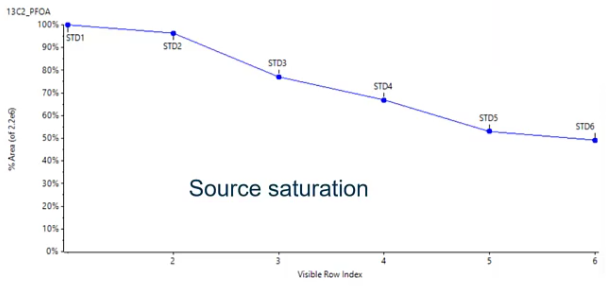 So we’ve added too much internal standard. And if we think back to session one and session two, where we talked about ionization. So if we’re using the same isotopically labeled standard, it’s going to be eluding at the exact same time, more or less as our analyte of interest. And they’re both competing to be ionized. So if we have a lot of internal standard, and we also have a really high standard concentration, we have those two things competing with each other. So we’re essentially getting some source of saturation only so much can be ionized at one time. And that’s why we sort of see this decreasing trend. So we want to avoid that.
Slide: How much IS should be added? (2) #
So the level we should use when sort of choosing an internal standard concentration should be somewhere in the middle of your curve. So we want to basically make sure that it’s not at a high enough concentration that we’re observing any source saturation, but it’s present in a value that is enough that we see it above our baseline.
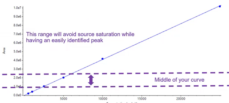 There’s no worry about it being lost in some sort of interference, and it’s reproducible. So somewhere in the middle of your curve of the low middle of your curve is usually a really safe place to start. Also, the less you use, the cheaper it will be. So kind of a GET TO for one there.
Slide #
Awesome. So we’ve gone ahead and quantified, but how do we be confident in our data? And this is where QA QC becomes really important.
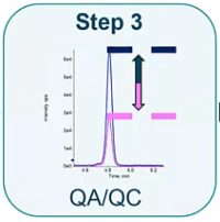 And how do we communicate to others that yes, this is the true value for this unknown sample, because that’s our goal.
Slide #
[20:46] So I just have an example of a batch here, it may vary a little bit depending on what kind of assays you run. But it’s a typical quantification, or quantitation batch where we have some blanks, a series of standards, usually between five and seven. And then we have some QC’s. And what you’ll notice here is that I have my samples bookmarked between QC’s and blanks, and that’s intentional. So typically, I would run 10 samples in between my PCs and blanks. And I’m using those QCs to determine if my curve is still valid. And so if I’ve been running for, let’s say, 72 hours, and it’s been 72 hours, since I ran my calibration curve, I want to make sure that that calibration curve is still appropriate for quantification. And blanks. blanks are really important to determine if there is any carryover present. So these little bookmarks will help make sure that my data is of high quality.
Slide #
But how do I assess is this good? Is my curve good? Is it acceptable? So I’ll go over some of the more common ways. So typically, when we’re assessing the calibration curve, we’re going to be using R squared. So an R squared value of above point nine, nine is usually considered acceptable. But that might vary a little bit depending on what method you’re performing. And then we’re going to use accuracy. So our accuracy is going to be how close is our predicted concentration to our known concentration. So we know the standard was at let’s say, 10 parts per million, how close is the calculated concentration to 10 parts per million. And a acceptable range usually is between 20 and 30%. Sometimes, depending on if you’re following a certain regulated method, you’ll find that the LLQ, or that low limit of quantitation will have a more lenient accuracy, sort of band, up to plus or minus 50% in some cases. But the takeaway here is that we want it to be between 20 and 30%, we want that R squared to be acceptable. And when we have that we basically have this narrow range or hopefully pretty wide range that we can quantify between so between our LLQ and or upper LOQ so everything above that upper LOQ we can’t quantify anything below that lower LOQ. We also can’t quantify. There has been sort of some discussion about using other approaches for validating calibration curves, especially with the EPA. And there seems to be some headway. They’re using things like root mean square error. But since this is the more common way, and we’ll just talk about that for now, and it’s likely those will sort of come around for the next couple of years.
Slide: Regression Weighting Factors #
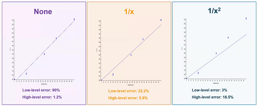
[23:44] So we’ve made a curve, but we haven’t talked about weighting. And weighting is really common, and also really important in LCMS analysis. So on the left hand side in the purple box, we have a calibration curve. And we have no weighting applied to it. So it’s just our calibration curve. And if you look at it, at our low end, we’re getting some pretty high error well outside are acceptable 20 to 30%, right. So it’s doing a really bad job predicting the concentrations are calculating the concentrations of our lower standards and analyte and QC, etc. But it’s doing a great job at the high end. And this is kind of common for LCMS analysis.
 So what we typically do is apply a weighting factor. So
 one over x, which would be the more common weighting factor is going to apply a little bit of a bias to the lower end of your curve. So you can think of it as kind of I like to call it like shifting your curb. And what you see is that you get a much better accuracy at that low end. So instead of having 90% Now we’re down to around 20% at that low end, so it’s doing a much better job calculating those values. And we haven’t really sacrificed much on the high end We’re still well below that acceptable 20%. If we wanted to take it a step further, and wait that curve even more, we could use a one over x squared approach. And here we’d have a curve that’s doing a really excellent job predict or calculating the values at the low end. But at the high end, it’s, it’s, it’s increased, still acceptable, but maybe to you, this wouldn’t be acceptable, and you’d want to go with something a little more common, like the one over x. But regardless, I’d say most cases, you’ll find yourself requiring some sort of weighting to your curve.
Slide: QC Sample Terminology #
And before we move into some of the calculations, that’s just kind of clean up some of the terminology. So you notice in my batch, I had blanks and double blanks.
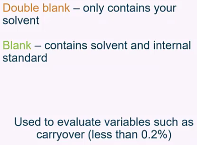 So at least the way I use these terms, and the way I find most folks use these terms, a double blank would be essentially a solvent blank, or the matrix that you’re injecting, with nothing in it, versus a blank, which would include internal standard, typically. And these, again, really great at assessing carryover, I always recommend running a blank after your high standard to make sure that you are experiencing any of those issues, versus our low QC and our high QC. So these would be a quality control sample and a known concentration at the low end of the curve, and a quality control sample at the high end of your curve at a known concentration. So again, these are just being used to assess that your curve is accurate, you’re doing a good job sort of predicting or calculating your unknown samples concentrations, even if it’s been hours or days, since you last ran a calibration curve. in some labs, especially if you’re coming from the GC world, you may be well run QCs. And if your GCS are passing, you don’t even run a calibration curve until those QC fail. So it will depend a little bit based on your lab setup and two years sort of reporting to.
Slide: Matrix effect and Extraction Recovery #
All right, so how do we use those samples to give us some, some data.
 So matrix effect and extraction recovery are two big pieces of data that we’re going to want to understand from a method standpoint, and also want to assess, I’d say a batch to batch standpoint. So typically, best practices would be to go ahead and extract a matrix blank with every sample batch that you produce, and to go ahead and extract a spiked matrix sample, and they kind of give us two different but important pieces of information.
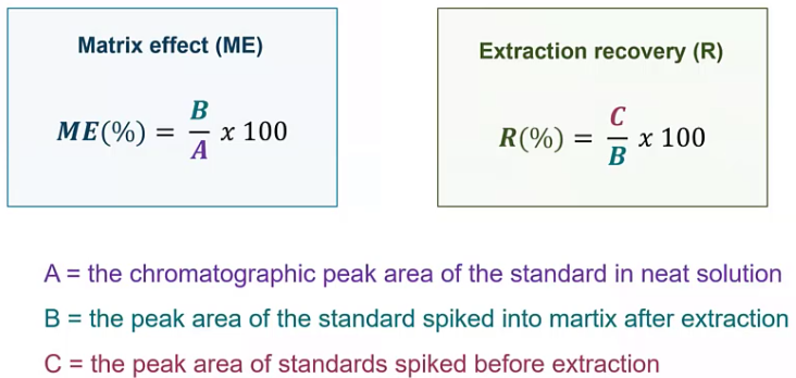
Let’s start with matrix effect. So the matrix effect, how much is there a matrix impacting our results. So here, we are doing this, without taking into account any part of the extraction. So we are taking our matrix, in this case would probably be our matrix blank, and spiking our standard on top of that matrix blank, or then dividing it by the area of the neat standard. So we don’t have to worry about things like recovery. Any losses that are coming from the sample extraction, we’re just taking an account that matrix, so we’re trying to figure out is there any suppression or enhancement. So since we’re normalizing to 100, in a perfect world, this should be 100. When we talk about extraction recovery, here, we’re using that pre spike sample before extraction. And we’re dividing that by the standard area. And this is going to give us an idea of what our losses are, and the amount of loss that’s acceptable use going to kind of change. So maybe you can say plus or minus 30% is acceptable. That being said, if you’re using something like surrogates, you can go ahead and use those surrogates to correct for that. So that’s commonly referred to as an isotope dilution method. But you can even if you say have 50% recovery, well, you have that isotopically labeled surrogate that you can use to correct for any losses that are occurring during that extraction process. Or maybe it’s just something you want to monitor.
Slide: Matrix Factor #
And when we talk about matrix factor, so matrix factor, also commonly referred to as matrix effect, depending on what circles you’re involved in here. we’re really trying to figure out is there enhancement or is there suppression? So in this case, I have my purple, which is my neat and my samples, which is my spiked matrix, and you’ll see that that peak is smaller than the purple peak. So if these were a one to one ratio, that’s great. We are seeing no matrix impact. Since it’s smaller though, what we’re essentially saying is yes, there is some suppression occurring. And again, that’s the more common especially as you get into Some of these more complicated and traditionally dirty or matrices, maybe you’re doing something like serum or soil or plasma suppression is something we all have to live with. And we can try to find ways to work around it like using surrogates and internal standards. enhancement is a little bit more unusual. Typically, if I see enhancement, it’s usually an APCI, over ESI. But I’ve seen it in ESI, too.
Slide: Ion ratios #
And finally, when we want to be very confident in the data, we’re reporting ion ratios. So if we take a step back to session one and think about what the kind of experiment we’re doing, we’re doing an MRM experiment. So we’re using our Q one to filter for the parents, in this case, the 215. And we’re going to create some fragmentation. So when we create this fragmentation, we have a few 50 different fragments to choose from. So in this scenario, I went ahead and isolated for the 185. And that will be my MRM experiment. That being said, we could do a separate experiment and isolate for the 193. And if we wanted to use ion ratios, that’s exactly what we do.
Slide #
So when we talk about ion ratios, we’re talking about the ratio between the qualifier and the qualifier. So the qualifier is typically the most sensitive fragment, and that’s what we’re going to use to calculate a concentration. The qualifier is typically the second most sensitive fragment. And what we’re doing is we’re looking at the ratio between these two. So if we just look at the pink peak, and the blue peak, the ratio here should be the same always. So when we calculate our ion ratio, we’ll divide our qualifier by our quantifier, or vice versa, it doesn’t really matter. But this is the way we typically do it at Sciex, and you’ll get your ion ratio. And we’re calculating this from our standards. So we know that analyte is in our standards, we know it’s a nice, neat analytical standard, that ratio should be the same whether we’ve injected one pika gram, or 100 pico grams, that ratio is going to stay the same. And we can use that in our unknown samples to be more confident in whether or not this is truly our analyte of interest.
Slide #
In terms of what is acceptable versus what is unacceptable, typically, folks will use a constant tolerance. So plus or minus 20 to 30%. This works best when you’re quantifying qualifier or similar size. That’s not always the case, though. And if you find yourself in a situation where your qualifier is much, much, much smaller than your qualifier, using something like a variable tolerance might be more appropriate. And variable tolerance is really just saying, if my ratio is very small, then I will give myself more tolerance there, because there’s a small little change in that ratio is going to have a big effect versus if my ratio is pretty similar closer to one, I’ll use a tighter tolerance. So it will depend a little bit on your assay, and specifically the analytes of interest.
Slide #
[33:20] So here, I have a sample. I’ve got this serum sample. And I’m looking for my analyte of interest. When I look at my standard, I’ve got my blue line and my pink line. And you’ll notice those horizontal lines represent what the ion ratio should be, with the finally data lines being the plus or minus 20%. Perfect. my qualifier looks great, it’s right where it should be. But when I look at my unknown sample, all of a sudden I say, oh, no, I don’t see my qualifier. So this would tell me something’s wrong. Likely it means that this is not my analyte of interest, that and that ratio should be the same. So maybe this is some sort of interference. I’m not sure what this is. But I can be pretty confident it’s not the compound I was looking for. So I wouldn’t want to go ahead and report this as a positive. So that’s how you can use ion ratios to be really confident in the data you’re outputting.
Slide #
So we’re confident now but how do we communicate some of these results?
 Communication is the most important part of what we do. Because for communicating to regulators, to non scientists, to other scientists, what our results are, so they can use those results for whatever application they might need, whether that be research or in a clinical world or in the environmental world for remediation. We need to communicate those results to other folks. So how do we do that?
Slide #
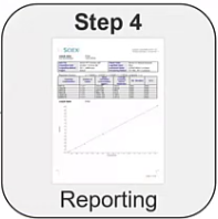
And that’s where reporting comes into play. So reporting might not be the most interesting topic, but it is a very, very, very important topic. And there are a few different types of reports that kind of exist. And it will depend a little bit on who you’re communicating to. So one really common type of report would be a word processing report. So something like Microsoft Word, or even more commonly, PDF. Typically, PDFs are chosen just because they’re lockable so that someone can’t edit them. But again, it will depend on the environment that you’re in and who you’re reporting to. So the nice thing is about these types of documents are you can include images. So we talked about integration, for example, we may want to show our QA, QC department, our supervisor, how we integrated these peaks, so they’re confident that we’re doing it correctly. So we may want images of those peaks on our report, or we may be super proud of our calibration periods. And we want to include that calibration period on our report. So hey, yes, this is linear, everything is looking good. So these types of word processing reports are usually very good at that. downside to these reports, is as you start to add those images, especially if they’re high quality, they start to get really big. And if you’ve ever opened up a large Word document, you know how frustrating that can be sometimes. And also, it usually means that somebody has to review it. So you’re usually relying on a person to go through this report. So that can be a little tedious.
Another option would be a numeric and text based report. So these are equally as common. And here we are essentially using a text file. So we’re including any text we need to include and any numeric value. And because it’s just a text file, these files, even if they have 10,000 samples in them are still relatively small and easy to manage. And you may be taking this data and moving it into something like Excel, where you have a macro you’re running or R to do some further data analysis. I always try to avoid transposing data into other software’s if you can. We didn’t talk about it here. But there are some functions inside so so you can do a lot of those calculations from Excel right in the software. And anytime you can prevent or not transpose data into a different software, you eliminate sort of that risk of errors occurring. But these data files are super small, you can transfer them right to LIMS, share them between colleagues with with relative ease. But that makes them very editable, too.
And then a LIMS system. So laboratory information management system, this is kind of the gold standard, I would say when it comes to managing labs that are producing a lot of data and a lot of samples. So this is an automated system that you can either drag that text based file into, or can link directly with the software looks X OS. So the data is going into this LIMS system, any further calculations that need to be done are being performed, any flagging that needs to be done is being performed. It can be a great approach, if you are sharing data with say a customer. And you want to have a nice sort of clean report at the very end. But some of the downsides here, they can be expensive, depending on what system you go with. If you build it in a house, it could be a lot of work. And you usually need someone to sort of be there to maintain it. Versus if you go to say another company, all great choices. And it’s really going to depend on who the end user is. So if you’re submitting a report to your QA, QC department, they’re gonna want to see integrated curves. If you’re submitting a report to a cannabis cultivator about what pesticides are in their sample, they don’t really need to see the integrated peaks and curves at imagine they really just care about that final concentration value.
Slide #
[39:23] And that’s going to really dictate what information you put in your report. So typically, things like sample name, etc, would be very common to include in a header. But when you get down to the granularity of like, integration algorithm, for example, probably not super important to that cannabis cultivator, for example, but maybe really important to your supervisor. So I always recommend, after many, many years of building reports for folks to sit down as a group and discuss what data you really need to show? what data is absolutely necessary and what data if we need to go back and check we have the data files stored somewhere and we can look but it’s not necessary to be on my Report.
Slide #
And the same would go for our table, which has our analytes or concentrations, usually retention time, what data do we absolutely need to show to communicate my results to someone else? And what data can we sort of document include? That’s just not relevant to this particular customer regulator, etc.
Slide #
Awesome. So with that kind of wraps up some of our data processing, tips and tricks and how to be a little bit more efficient. Remember, it all starts with integration. So when we think about integration, the big thing I want to stress is to be consistent consistency is arguably the most important thing. So sit down with your group, decide on how you’re going to sort of address those kinds of situations that we talked about. Maybe you’re you’re a food lab, and you want to draw feet, or you want to draw a tight baseline and exclude that matrix interference. Either works, just make sure that you’re being consistent quantification, internal standards and surrogates. Although it’s an extra step can save you a lot of time and effort and also allow you to be a lot more confident in your data. So in addition to sort of the QA, QC, samples and approaches, having surrogates internal standards, can account for some of those crazy situations where maybe this one particular soil has a ton of suppression, and just gives you another tool in your toolbox that you can use to be confident in your data. And finally, communicating those results to others. Know your target audience when you’re when you’re creating these reports, because that’s going to really change what data you need to show and what data you need to include in your reports.
Slide #
If you’re interested in some step by step instructions on how to use say sax OS, or multiquant sound Learning Hub is great. It will walk you through building a process method to quantifying results to making your own reports. So if you want to sort of dive in and get into some of the neatty gritty, I really recommend you check out sacks. Now, those courses are mostly free, I think, if not all of them. So they’re great resources.
Q&A #
Great, thanks, Karl, for the great presentation.
Q#1
So the first question is around a double blank. You mentioned a double blank in the presentation. What how do you define a double blank? And how does the double blank vary from the standard definition of a blank?
Yeah. So I should mention that this is how I typically and how we SCIEX define double blanks, there may be some variability depending on the group you belong to. But a double blank usually is pretty similar to the solvent blank in the sense that it does not contain any analytes of interest. There’s no internal standard of surrogates, etc. So it should be pretty close to the solvent you’re injecting. Whereas a blank usually includes those internal standards. So that’s the big difference between the two.
Q#2
Excellent. The second question is around the use of internal standards, how do you correct for ion suppression using internal standards? And how do you correct for any recovery issues using surrogates? Can you comment on those?
Yeah, definitely. So that’s where you’re relying on that ratio. Right. So what we’re assuming when we use an internal standard is that internal standard should experience that suppression, similarly to that compound of interest. So if our analyte is experiencing suppression, our internal standard should also be experienced that suppression. So when we take the ratio, we’re essentially correcting for that. So when we take the analyte area over the internal standard area, we’re correcting for that suppression that we’ve observed, versus something like a surrogate. So a surrogate here, that, that does experience suppression, too, right. But we’re really using that information to get at our recovery and any sort of variability that we’re experiencing throughout our sample preparation. So there are a few different approaches on how you could use that. You could do the same thing that I just mentioned with the internal standard and normalized to your surrogate area instead. And that’s called an isotope dilution method. Or you could just monitor that make sure it’s within a sort of acceptable bounce. So it will depend a little bit on your goals and and how much recovery issues you’re experiencing.
Q#3
Excellent. Thanks, Karl. The second question is around how much is you talked about how much is and you mentioned, maybe put it in the middle of your range in the graph that looked like it was in the middle, or in the lower third. So can you clarify, do you use middle range as far as amount raw value of the analyte of interest? Or do you use your current level? So if you have five points, you put it closer to, you know, point three?
Great question. Yeah, yeah, that that is exactly what it meant. So I typically will use the middle part of my curve. But for me, if that’s around, you know, standard point three, that’s totally fine. What I’m really sort of getting at is to avoid having it be at the higher end of your curve. So you don’t experience that sort of depression. And also, I really want that value to be or that concentration to be at a point where I’m not worried about my baseline noise being too high. Or it’s at such a low level that I’m worried that there might be some variability between injections just because I’m sort of scraping the bottle, and they’re all in terms of sensitivity. So I just want to make sure that I have a nice strong signal, but not too high. I know that’s a little vague. But somewhere in that middle range is usually where I’ll shoot.
Q#4
Thanks, Karl. The next question is also around amount, but it’s in relation to QC’s, we also discussed the low and the high QC, how do you go about determining what a relatively good concentration level for your loan high QC might look like?
Yeah, great question. And some labs will even include a midpoint QC. So it really is going to depend a little bit when I’m a notoriously lazy person when it comes to pipetting. So when I choose my mid and low, or my sorry, my low and high points, I usually use a very similar concentration to my standard, not the exact same concentration of the standard, because it makes it easier for me when I’m pipetting. But that’s been my approach, you can also go ahead and just choose something in between two values. So you’ll see a lot of folks use if you have standard four and five, their QC will be evaluated between standard four and five. And that just makes sure that we’re seeing, you know, accurate quantification of those QC’s.
Q#5
Excellent. The next question goes on to calibration curves. So if you have a good R squared value, the example given was like a point nine, nine. So you have excellent linearity within your calibration curve, should you still consider utilizing weighting? And if so why?
Good question. And there’s been a lot of talk in the analytical community about whether r squared is really the best way to assess our curves. Traditionally, it’s what we’ve always used. But maybe there’s some new approach that we can use to be a little bit more confident in our data. I’d say though, if you’re using R squared, and you have a great R squared value, to decide if you need to apply some weighting, it really depends on the accuracy of those standards. So when you look at the calculated concentration of your low calibration curve, versus your high end, if you are getting great values, you know all your errors below, whatever it might be acceptable to you to say 20% Feel free to forego the weighting. But if you notice that, hey, the bottom end of my curve is experiencing quite a bit of error compared to the high end of my curve. That’s when you may want to apply something like a one over x weighting.
Q#6
Excellent. Our next question is also around calibration curves. And you talks about different regression types linear quadratic fit, can you explain how you choose between the different fits? When would you go away from maybe a linear fit? And also in that? You mentioned a Wagner regression? Can you explain a little bit further on on Wagner regression and when it might be blessed?
Good question. So I’ll I’ll say I’m a little bit of a purist, I pretty much always use a linear curve. Typically, in my experience, if I need to use a quadratic curve, there’s likely something I can fix in my method to correct for that. So I mentioned some source depression, for example, if you’re experiencing sourse depression, oftentimes you ended up with this sort of quadratic curve. So a good way to assess if you know, Hey, is that a carrier would be to plot your internal standard area over time, or I’m sorry, over the concentration levels, to see if you see that decrease. But typically, you’re going to be in a linear range. So if you do have that quadratic curve, I’d be worried that you’re experienced some saturation, whether that be at the detector or the source. That being said there are some cases where you just can’t avoid it. That’s just the nature of the beast. But in most cases, it’s something you can probably address with your method. And the same I’d say for for Wagner curve as well.
Q#7
Excellent. The next is about using standards and surrogates and the analyte How do you monitor isotope dilution analytes when you’re using internal standard surrogates or analyte calibration curves?
yeah. So when we when we talk about isotope dilution, right, for those who are unfamiliar, we’re using that surrogate to essentially correct for those recovery differences that we might experience just due to sample prep or just the nature of that compound. So we’re, instead of using that internal standard, to correct for any variability, we’re using that surrogate area to correct for that variability. And depending on a method that you’re following, usually there’s an acceptable bounce for that surrogate recovery. So just like I showed in the previous slide, when you calculate that extraction, recovery, you do the same thing for all of your surrogates and ensure that it’s within whatever is acceptable to you, typically, that somewhere between 50 and 150%. And you’d want to monitor that value over time, you know that you’re adding the same amount to every sample. So really, in a perfect world, when you divided by the neat standard, you should see the post extracted standard, you should have a ratio of one or 100%.
Q#8
Excellent. The next question is around manual integration. So we talked a lot about the integration of the software, is manual integration, a practice that, you know, is considered acceptable, especially when it’s to accommodate for moving retention times? Or is the fact that you have to manually integrate indicative of a bigger problem?
Yes, great question. And I’d say if you find yourself having to manually integrate, often, then yeah, it’s probably indicative of a bigger problem. So if you find your retention time is shifting, often. Maybe it’s time for an ID column, or maybe there’s some air in your airlines that’s causing that a bigger problem than just just manually integrating. However, if you have an unusual sample, maybe with some bizarre interference that just isn’t present most of the time, maybe it’s the first time you’ve seen it. That’s when manual integration can be a useful tool. The other case, where I see pretty commonly used is when you do have isomers. And if you don’t use the suggestion that I showed earlier with how to integrate them all, some folks will just draw a large line to integrate all of the the isomers together. So that would also be another sort of acceptable usage. This would be tedious if that’s your analyte of interest, and you have to do it every day for every sample.
Q#9
Excellent. Question around building applications for summing ions when you’re using quantity quantitation? What type of application? Would you use the sum of an ion? And we know that that’s capable in SCIEX OS, but if they’re acquiring data, or processing data using analyst or multiclient? Is that also a capability?
Yeah, certainly, regardless of the software you’re using, you can do summation. Personally, where I use it is when I do polymer analysis. So usually, I’m not super interested in calculating the concentration of all of the individual homologues. And instead, I just want a total concentration of the safe polyethylene glycol. So that’s when I would use summation. So if you find yourself in that point, maybe you’re doing some sort of protein analysis or something like that, summation might be a good option for me, polymer analysis is where I use it more frequently.
That is all the time we have for questions today. I would like to thank you for providing such insightful questions. And thank Karl for sharing that great information. I hope you enjoyed today’s session, and we will see you for the next LCMS 101 Have a great day.